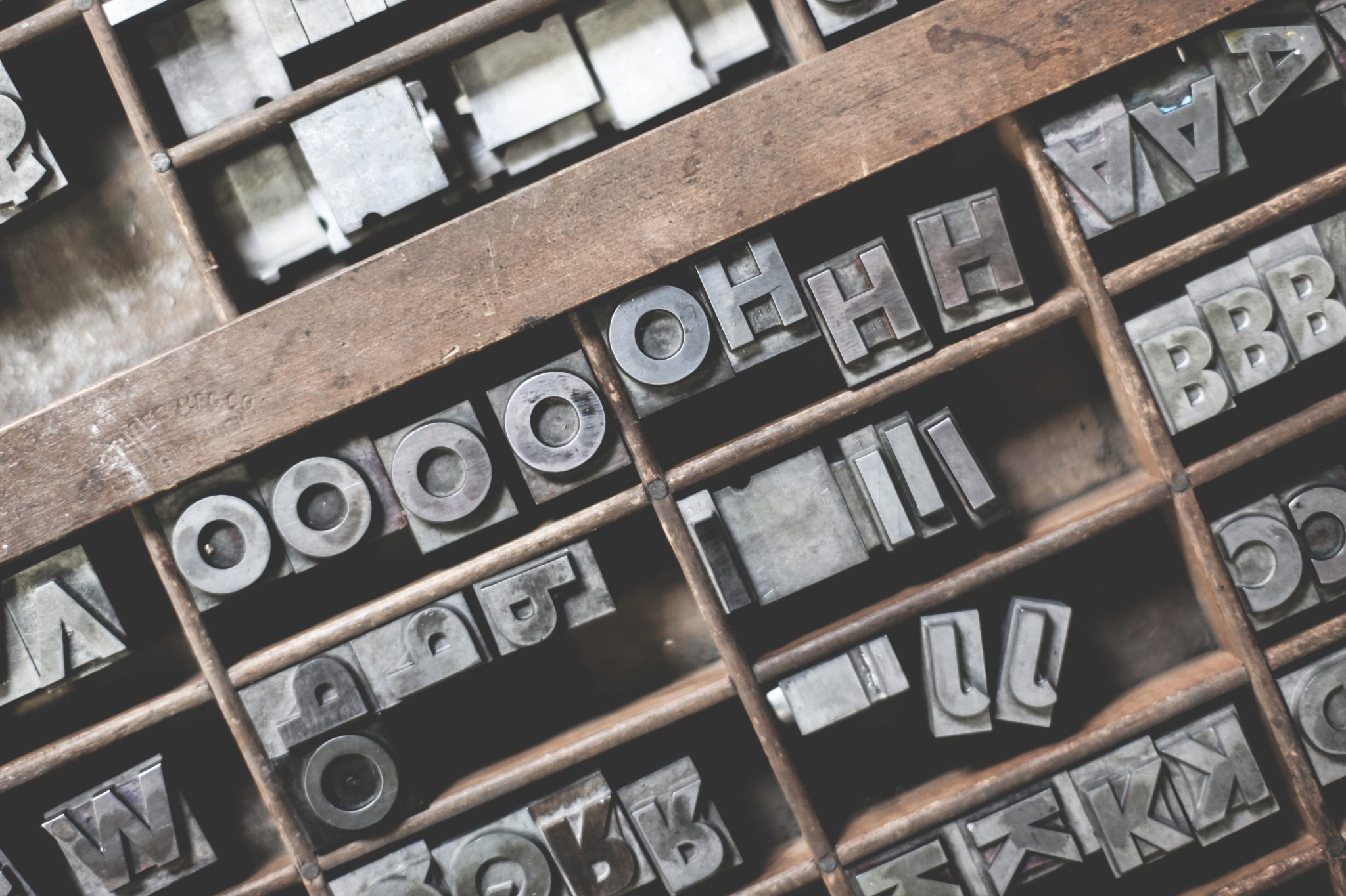
The Importance of Typography in Communicating Through Graphic Design
Typography can affect everything about how a message is perceived, so it is a huge part of communicating through graphic design. And yet, people rarely notice or acknowledge its importance.
In actuality, typography etches its way into everything, from television ads and magazines to content on websites and signage. It is the art of arranging text in a particular way, taking into consideration things like spacing, color, and size. Here are five reasons why you should take the matter of typography seriously in your graphic design work.
Typography Captures the Attention of the Audience
First and foremost, typography is about capturing the onlooker’s attention. In graphic design typography courses, students learn about all the ways it is used to effectively garner attention from an audience.
A book title is written with specific typography to draw the eyes to the cover, for example. Beyond just the appearance and placement of the font, a certain mood or feeling must be conveyed through it to build anticipation or curiosity is most often conveyed to hold what is garnered.
Typography Helps Establish Information Hierarchy
Look at a well-designed infographic posted on a website, and you will get a good look at how typography establishes information hierarchy. When a lot of text is grouped together, utilizing typography to differentiate the information helps a reader digest what is being shown. This is such a pertinent part of typography that entire courses are devoted to hierarchy and form of typography in graphic design school.
Typography Builds and Fortifies Brand Recognition
When typography is used in marketing efforts, it is often used as a means of building brand recognition. Think about your favorite brands and their logos, and why those logos are so recognizable; it is the typography used that does all that. For example, if you were to spot a Pepsi logo executed in a style that is undeniably Coca-Cola’s, it would tend to be confusing because the typography used is already clearly associated with a different brand.
Typography Portrays Professionalism to an Audience
Formalizing the structure of typography gives you the power to build a professional persona before an audience. Certain types and placements of fonts can create an air of professionalism to onlookers. For instance, a scripted font looks far less professional than something written in Times New Roman, Arial, or Calibri, because of the touch of whimsy it exudes.
Résumés typed out with a fun or casual font is much less likely to be taken seriously by the hiring manager. On the other hand, a product intended to attract teens are likely to be ignored or dismissed if it the style used is formal and rigid. Typography must play to the product’s target audience, therefore.
Typography Has a Visual Voice or Personality of Its Own
In graphic design courses, students are exposed to multiple aspects of typography as an integral part of graphic design. One of the initial courses most students take is an introductory course to visual communication. Here, students will learn just how much certain forms of typography convey messages beyond what is actually being stated. The same word can have a different impact depending on the lettering or font type. The attributes of the lettering directly relates to how the message is perceived.
Typography is just another way to effectively communicate a message, not just through text but also through visuals. Make the most out of the benefits of typography for the best design results.
Typography is one of the core classes offered at Academy of Art University’s School of Graphic Design. Get in touch with our admissions representatives to request information on our art & design degrees and programs. You can also start applying now for the 2020 school year.