
The Most Common Fonts That Every Graphic Designer Has Opinions About
Designers all have their favorite and not-so-favorite fonts. Some of the most common fonts are well-loved by many, while others are almost universally despised.
Fonts have power, personality, and panache. They trigger associations and memories that transform the meaning of the message. The most common fonts aren’t background material — they’re backbone material. Even the best fonts are hated by some, and many of the worst have their fans. Following are seven fonts that every graphic designer has a strong opinion about.
Comic Sans
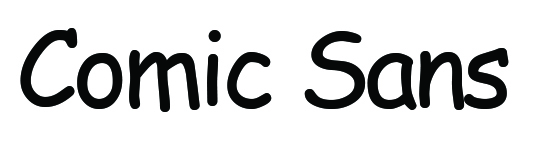
As its name implies, this font was inspired by the fonts used in classic comic books. Created by designer Vincent Connaire, Comic Sans is a casual, sans-serif typeface for use in children’s and casual materials. Nowadays, Comic Sans has been used inappropriately on many noticeable occasions that some designers have developed a strong dislike for the font.
Helvetica
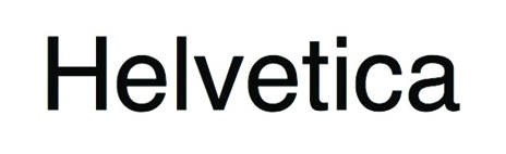
The original sans-serif typeface, Helvetica is the result of the combined efforts of two designers from Switzerland seeking to create a minimal, clean, and highly readable font. Soon after its debut, the rest of the world quickly got on board. Helvetica quickly reached the distinction of being the most widely used font, an honor that still stands true today. This well-loved and used font even starred in its own documentary film in 2007.
Papyrus
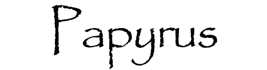
Inspired by the imagination of designer Chris Costello upon college graduation, Papyrus has been widely used since its creation in 1982. It’s designed to resemble what Costello imagined the English language would have looked like written on the original paper, papyrus. Though the font resembles calligraphy, it isn’t nearly as ornate.
Gotham
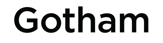
Designer Tobias Frere-Jones created Gotham to provide a no-nonsense reader experience that makes it appropriate for professional use. It’s been used as the official font of presidential campaigns and on the cornerstones of buildings with worldwide significance such as the One World Trade Center.
Who knew Gotham was the result of a commission on the part of the magazine Gentleman’s Quarterly? The publication wanted a fresh, sans-serif typeface featuring a geometric structure and a modern, masculine style. So, Frere-Jones gleaned his inspiration for the font from the lettering on older buildings in New York City’s classic neighborhoods.
Poppins

Introduced by the Indian Type Foundry in 2014, Poppins is the new kid on the typeface block. Its minimalist styling makes it a favorite of web designers seeking a no-fuss appearance. Like most modern typefaces, it’s sans-serif and features geometrical formation.
Futura

Like Poppins, Futura is a geometric, sans-serif font — but unlike Poppins, it wasn’t born almost yesterday. Designer Paul Renner developed the font as a part of the New-Frankfurt project in 1927. So, Futura is the old man on this block of fonts. Its consistent popularity throughout the years proves that the font has significant staying power. Because it brings timeless and classic elements to the picture, Futura is the favorite of many large corporations. As an added benefit, it fits in with any design scheme.
Impact

Introduced by designer Geoffrey Lee in 1965, Impact was developed for conveying strong statements and otherwise making an impact. However, designers are nearly universal in their disdain for this font. A common complaint about Impact is that it looks amateurish, and anyone who uses it clearly does not know how to pick fonts.
Nevertheless, that didn’t stop Microsoft from selecting it for use on the packaging of their Windows products. It was also chosen for Microsoft’s Core Fonts for the Web project in 1996. Although Impact was intended for use in headlines rather than as body text, it is now commonly used in internet memes.
Want to create your own typography or design your own materials? Request information to learn more about the School of Graphic Design at Academy of Art University. You can also Apply now if you want to get started on your career soon!