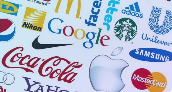
Logo Design Starter Kit: Tips for Beginners
RSVP to join the School of Interaction & UI/UX Design’s FREE online workshop on creating an animated logo on July 28 at 7PM PDT. But before that, make sure you have some basic information on logo design at least.
A company logo is a design that tells people who the company is and what they do. Whether your logo design uses a picture, words, or a combination of the two, it needs to be memorable enough to grab and keep people’s attention. We outline several steps to create attractive logo design below.
Know and Understand the Brand
You should always know the target audience when creating a logo. Start by thinking of everything that helps to identify your brand and write them on a story board. You can then narrow down the possibilities by deciding what impact you want the logo design to make. Do you want to be irreverent or evoke some type of strong emotion? Your logo web design will become easier once you know what you’re trying to achieve.
Design the Name Around Brand Identity
Every brand has its own unique identity, and it’s your job as a logo designer to introduce it through visual means. You should understand the history of the company you’re designing the logo for well enough to create a logo rich in meaning and purpose.
Keep Your Web Design Logo Clean, Flexible, and Simple
Logo design should be simple enough that people don’t need to study it for more than a few seconds to understand it. Remember that people will view the logo on a computer or smartphone screen and not just paper. The fonts, colors, avatars, and related details must remain flexible enough to change if necessary as well as appear in a range of formats.
Know Your Colors
Color in advertising is so important that there’s a whole psychology behind it. For example, a zipline rental company appealing to young, adventurous college students would choose a bold color like red because it conveys energy. A company that publishes books for retirees might choose white or beige for a more subtle message.
Maximize Technology by Using the Right Tools
The good news about logo design is that you never need to go it alone. Multiple resources exist on the web, and you can even find pre-made logos where you only need to add the finishing touches. Do-it-yourself logo design websites are another possibility.
The important thing is to take advantage of every resource or technology available to you to gain the theory and practice employers expect in logo and web design.
Aim to Be Unique
While you might admire other logos you see, business owners won’t see it as a form of flattery if you decide to copy some or even most of the design. You could also end up defending yourself against a plagiarism charge. To capture the attention of potential customers, your logo design needs to say something new in a way never communicated by anyone else.
Pay Attention to Font Size and Style
The typeface you choose for logo design sends an important message about the brand. You wouldn’t use casual or whimsical-looking scrawls when designing a logo for academia, or bold capital letters when you want the brand to come across as understated. To convey the message and brand personality you desire, you need to put as much time into choosing font as you do in choosing color.
Create an Active Logo
A logo that appears to be in motion sends a different message than one that lies still. The first type tends to encourage people to take action such as sign up for a newsletter or make a purchase while the second can cause them to feel more contemplative.
Make Use of Negative Space
Negative space lies between and around the subject of the logo. It appears as shapes that share the same edges with the main image, also known as positive space. Using positive and negative space can bring a striking sense of balance to the image that creates a lasting impression on viewers.
Academy of Art University is open for the fall semester. Request information from our admissions representatives for more details on our online education program. You can also apply now to get started on your journey with us.
Hero image courtesy of Triond