Keeping Up With Design Trends: Top Best Practices to Follow
No matter which design industry you end up working in, knowing and using these seven best practices is essential.
As we’ve established in previous posts about bygone design trends, old trends that are making a comeback, and new trends that are on the rise, design trends change every year.
However, many design best practices manage to stay relevant across the years. If you’re unfamiliar with the term, “best practices” are broad guidelines or rules of thumb about how to conduct your business, work in a team, and more.
Best practices can help you make the most of design trends while also producing high-quality work. Whether you’re currently a student or a working professional, keep the following seven tips in mind.
Be a Team Player
By the time you graduate from art school, you should understand the importance of collaboration.
In the professional design world, big projects are often handled by teams, not single designers. You could be an illustrator working with a comic book writing legend, or in a group of students tackling a design challenge handed down by an automobile industry leader — teamwork is still important.
Collaboration involves communication, compromise, and sharing the workload. All of these things help prevent misunderstandings or other problems that could affect your finished product. In addition, good teamwork makes difficult projects go that much smoother.

Be Flexible and Adaptive
As a designer, your goal is to help bring the client’s vision to life. That doesn’t mean be a pushover; if you have a good reason for making a design decision, then by all means explain it.
But no matter how much time and effort you put into your designs, keep your mind open to feedback. Take constructive criticism or suggestions from others into account, and make modifications to your designs as needed.
In the end, being flexible can help you improve your designs and maintain a high degree of professionalism.
Design for the Medium
Different design trends work better with different mediums. For example, what works for a print magazine might not work for an Instagram ad. What works for a mobile app might not work for a website. And so on, so forth.
Since designers are often expected to create assets for multiple platforms or mediums, be sure to tailor your work to the medium for the best finished product.
Create a Strong and Consistent Brand
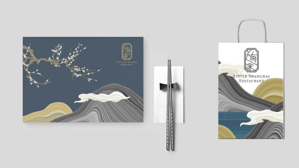
While it’s fine to experiment with different design trends, the work that you put in your portfolio or show to clients should have a consistent look or theme.
In other words: you want to have a strong brand, identity, or style. Whether you work in photography or advertising, making too many modifications to your brand can have a negative impact on it. Your work shouldn’t look like it was made by six different people; it should look like it was made by you.
To incorporate new design trends, try doing it in subtle ways that won’t weaken your branding scheme. If the idea of “branding” is totally new to you, there are classes such as the School of Graphic Design’s Senior Portfolio class or Branding Strategies class that can help you develop your style.
Update Your Portfolio
Speaking of portfolios, updating your portfolio can help you impress employers or clients. This means continually adding your newest work to your portfolio — and keeping up with the latest trends in design.
Your design portfolio is a key part of helping you find work by impressing employers or clients. From time to time, check the latest trends in design. You might find that you can use one or more of these trends to create fresh projects to include in your portfolio. Being able to show others an updated portfolio shows that you’re committed to staying on top of the latest trends in your industry.
Curate Your Message
Whether you’re promoting a brand or a new product, the goal of your design is to communicate a message. More than that, your design should be simple and easy for others to understand.
So curate your message. Edit the information you’re sharing as needed. Be strategic about what you show people. Too much information can overwhelm the viewer or clutter the design, whereas too little can make it seem empty. Strike that perfect balance.
Choose Typography with Care
We’ve discussed the importance of typography in greater depth before, so we’ll spare you the long-winded recap.
To summarize: a number of different design industries rely heavily on typography. Take advertising, graphic design, illustration, and web design, for example.
Design trends in typography will change over time, but latest doesn’t always mean greatest. Again, it doesn’t hurt to experiment — as long as you remember that the fonts that you choose should enhance your design and be easy for others to read.
If you’re pursuing a career in web design, photography, industrial design, illustration, graphic design, or advertising, the seven best practices described above can certainly help you out.
However, there’s more to design careers than best practices. Visit Academy of Art University’s home page, or request more detailed information about our onsite and online programs today. On the other hand, if you’re ready to embrace a future in design, why not get started on your application today?
Header image titled “Cat-nip Pattern” by School of Illustration MFA student Joan Alturo
