Popular Design Trends for Online Portfolios to Help You Promote Your Work
Keeping up with portfolio design trends can help you stay current and impress employers.
All designers need a portfolio — a collection of work to show off their skills to potential clients.
You may be asked to bring in a physical portfolio to job interviews, but nowadays, many portfolios are hosted online as well. Not only is the Internet highly convenient, but it also increases your reach. Moreover, many employers browse the Internet to find online portfolios that they like.
As you build your online portfolio, keep the latest design trends mentioned below in mind.
An Emphasis on Cool Web Design
It’s not just about the quality of your work, but also how you present or showcase it. After all, you want to make a good first impression. Having a creative, professional-looking portfolio website can certainly help you be more memorable. For an example of a sleek setup, swing by School of Interaction & UI/UX Design student David Sigurdarson’s portfolio site.
From the graphics to the typography you use, your web design choices should reflect your style or brand identity (more on that below). For additional ideas, check out vintage design trends that are making a comeback or other recent trends, like minimalism.
Highlight Your Personal Brand or Identity
When someone says “brand,” you might think of big-name corporations, like Subaru, Jaguar, or Blue Shield of California — all of which Academy students have worked with. However, brand can also be personal. In fact, developing your own personal brand or identity is a key part of showing potential employers what kind of skills you have to offer. Think of it as having a strong style or “voice” in your artwork.
While your portfolio should also reflect your personal brand, knowing how to do this effectively isn’t always common knowledge. Portfolio development classes, such as Academy of Art University’s Portfolio Preparation for Illustration, can help you get a better sense of expectations and make your portfolio more cohesive. In addition, getting professional opinions from faculty and working designers can help give you an edge in the job market.

Use Large-Sized Fonts
This design trend is relatively self-explanatory. Large-sized fonts are back in style, since you don’t want recruiters to get a headache trying to read your website. In addition, larger fonts grab attention better and faster than tinier fonts do. School of Graphic Design student Hai Trieu Le’s portfolio site is a fine example of large fonts leaving a big impression.
In case you don’t know what typography is, here’s our blog post on the importance of typography. And if you’re all out of ideas regarding fonts, here are ten fonts that all designers have an opinion about.
Pick a Color Scheme
Again, you want to make sure your personal brand shines through in your online portfolio. This means you have to also consider color schemes for the site itself, which can leave a big impact on your visitors.
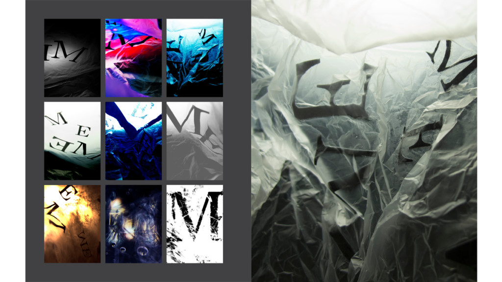
Do you prefer black and white paired with bold, solid colors, like School of Interaction & UI/UX Design student Briana Van Koll’s portfolio site? Or do you want to have an unapologetically neon web interface?
To get more inspired, explore major visual trends in graphic design, ranging from brutalism to 3D imagery.
Include Interactive Online Elements
What’s the point of an online portfolio if you can’t outfit your website with all sorts of fun gimmicks?
Making your portfolio interactive can catch the interest of employers and encourage them to dig deeper into your work. “Interactive” simply means that the user can move their mouse over an object on the page, and something interesting happens. Maybe the font grows larger! The opportunities are endless. For instance, School of Advertising student Elin Lindeberg’s portfolio site has vinyl records that pop out when the mouse hovers over a case.
However, it’s easy to go overboard with this particular design trend. The trick is making sure that your interactive elements are fun, eye-catching, and informative without being overwhelming.
Make It Convenient and Accessible
When people visit your online portfolio, they should be able to quickly and easily find what they’re looking for. Don’t make your visitors hunt around for your projects or other information on your portfolio. Instead, use a design setup that makes where things are located simple and obvious.
You could put links to your work right on your front page, as School of Advertising student Sofia Wiklander did. Adding a navigation bar can help you separate different types of projects or information. And putting all of your projects on a single page to allow viewers to scroll down, like School of Interaction & UI/UX Design student Wei Wang’s portfolio site, can also make your website accessible.
Don’t Forget Your Design Bio
Last but not least, visitors looking at your portfolio should learn more about you. What’s your educational history? Any fun facts that you want people to know? Let your personality shine.
One of the latest portfolio design trends is to have your artist bio smack on your home page rather than on a separate “About Me” page. However, this isn’t a rule of thumb, and plenty of creators have separate “About Me” pages. The important part is to have it!
Make it quirky, make it interesting. Get creative, but make sure that your bio is easy to read no matter what setup or style you choose.
In the world of design, most projects are a team effort. Creatives in illustration, graphic design, and photography collaborate while working on advertising. Professionals in industrial design and web design often work together closely on products.
Explore which specialty you’d like to be focus on. Reach out for more detailed information on our onsite and online programs at Academy of Art University, or get started on your application today.
Header image by School of Photography BFA student Rachel Holmes
